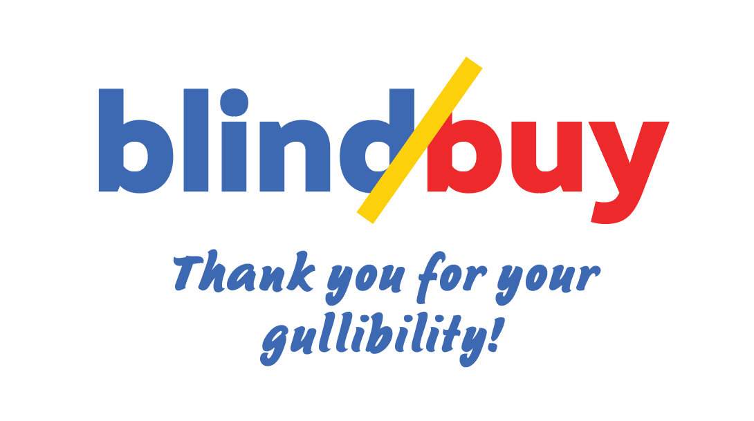
DON'T TURN A BLIND EYE
BlindBuy is a satirical product catalog designed to expose the hidden costs of consumer culture. By mimicking the glossy, familiar aesthetic of corporate advertising, the exhibition challenges viewers to rethink the everyday products they’ve grown to trust. From processed foods to personal care items, BlindBuy reveals how profit-driven corporations mask harm with friendly branding and feel-good messaging. It doesn’t demand that you change everything about your life—it simply asks you to pause, look closer, and consider what’s really behind the packaging.
Visual decisions like the exhibition’s color palette—bright red, yellow, and blue—isn’t just visually striking; it’s a direct reference to the psychological tactics used by major brands. These primary colors are chosen by corporations to evoke trust, excitement, and approachability, especially in fast food and retail. They’re engineered to disarm consumers, to make the harmful seem harmless. In BlindBuy, those same colors are repurposed to draw you in with familiarity, only to confront you with the uncomfortable truths hiding beneath the surface. The message is clear: don’t turn a blind eye.

Inspiration
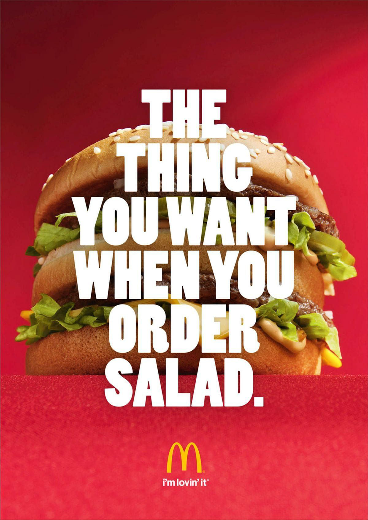
This McDonald's advertisement inspired my topic for this exhibition. It amazed me how this advertisement could exist—it almost blatantly says, "WE ARE THE REASON THE WORLD ISN'T HEALTHY." Corporations like this know exactly what they are doing. They have no problem degrading your health and damaging your future, as long as it gets them more money. And the worst part is, the advertisement is right. We lack self-control. We decide to ignore this degradation of ourselves because we have become addicted to stuff that's bad for us. What we are buying is a direct product of corporations' careful engineering to make us crave what they make. And they will continue to gladly feed it to us every time we return.
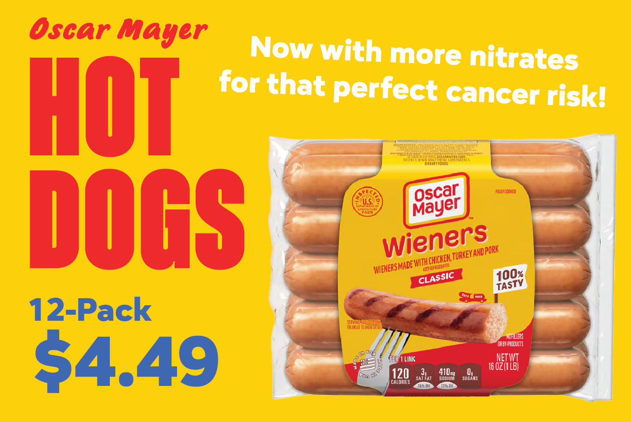
Everything is Intentional
If you look closer at companies and products you find every day, you will notice that they all tend to use the same tactics that convince us that what we are buying is life-enriching. One of the big goals of this exhibition was to reproduce the psychological tactics used by big companies to sell you these products that seem positive, but are mostly negative to your health and well-being. They often times use bright, eye-catching colors that succeed at both grabbing your attention and creating a sense of friendliness. The typography is intended to direct your eyes exactly where the seller wants you to look to take in the information efficiently. The copywriting and callouts to what makes the product special speak to you in an overly positive and fun manner, almost making it seem too good to be true. No warnings. No disclaimers. All smiles and joy.
Watch the explanation video